The Complete History of Car Emblems
Wondering how your favorite car emblems came to be?
According to Gallup, emotional connections are a key factor in the decisions people make about buying cars. Car emblems serve as a kind of shorthand, allowing people to easily recognize the brand and remember the connection they might have with it.
Wondering how those quickly recognizable logos came to be? In this guide, we'll give you the fascinating histories of some of your favorite car companies logos. Keep reading to learn what these emblems really mean!
1. Mazda
Mazda has had plenty of symbolism in its brand from the start.
The name Mazda is drawn from the ancient Asian goddess of harmony, intelligence, and wisdom, Ahura Mazda. However, the name of the founder, Jujiro Matsuda, also influenced the choice of names.
Mazda's logo went through many iterations before the modern one was introduced in 1998. According to the company, the "M" of the logo symbolizes wings, as the brand "flies" into the future. The center "V" part of the "M" is spread like a fan to represent vitality, creativity, and passion.
This sleek, modern logo represents Mazda taking its place among the top car dealers at the turn of the millennium, and it seems to have served the company well ever since.
2. Subaru
Subaru is known as the car of choice among outdoor enthusiasts and anyone who lives in Portland, OR. However, Subaru drivers might not realize that they can find their car's logo when they look up at the night sky during a camping trip.
Suburu's logo is made of six stars, which represent the Pleiades. This group of stars is part of the Taurus constellation - and Taurus is the Japanese name for Suburu.
In Japan, the Pleiades stars are especially easy to spot, and travelers have used them to guide their way for centuries. This is a fitting choice for the car associated with travelers and explorers.
3. Mitsubishi
The Mitsubishi logo is actually a combination of family crests.
The crest of the Tsukumo Shokai shipping company's founder, Yataro Iwasaki, combines with the crest of the Tosa Clan's Yamanouchi family.
Originally, these crests were a trio of chestnut leaves and a trio of oak leaves. The three-pointed fan logo takes these crest designs and simplifies and stylizes them for a car logo.
Unlike some car companies, Mitsubishi has actually been using its logo since the 1870s - well before the brand was involved in making cars.
4. BMW
Once upon a time. BMW manufactured airplanes. Those planes got painted in the local colors: blue and white.
BMW developed a logo that incorporated those colors, with a circular, target-like design that mimicked the movement of white propellors against the blue sky.
Today's BMW logo is among the best-known car emblems. Even though the company no longer focuses on airplanes, its logo has stayed largely the same over the decades.
5. Ford
Ford was one of the first widely recognized car manufacturers.
In the decades since the brand started, the logo has stayed intentionally simple. The oval symbol is easily recognized across the world, so why would the brand change something that holds so much weight?
In fact, today's Ford logo looks a great deal like it did in 1912. As the saying goes, if it ain't broke, don't fix it.
6. Volvo
Volvo's name has a hidden meaning, and its logo does too.
The name Volvo is strikingly close to the Spanish word "volver," meaning to return, to come back, or to go back. This symbolizes travel nicely for a car company.
However, the logo has a very different hidden meaning. The logo is comprised of a circle with an arrow pointing out of it, which comes from the ancient symbol for iron. Volvo chose this logo to represent its commitment to design. Iron is also associated with strength, bringing another positive connotation to the logo.
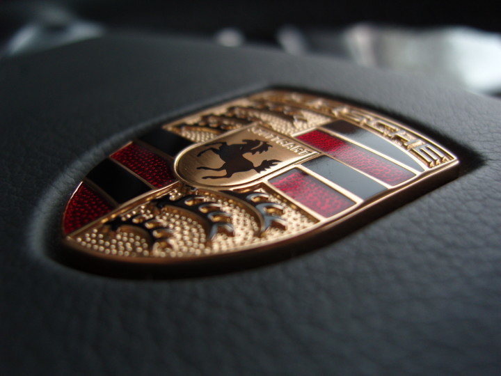
7. Porsche
Many of these brands have opted for simple, straightforward logos. Porsche, on the other hand, has a dramatically different logo with a decadent, glamorous design.
Porsche's elaborate logo actually celebrates the German flag with its red, black, and gold color scheme. Stuttgart, the name of the city where Porsche is based, is printed on the logo. Below the name, a stylized image of a horse symbolizes speed and power.
In fact, Stuttgart roughly translates to "stud farm," since the city was also known for breeding horses.
The rest of the logo references Wurttemberg's coat of arms. Stuttgart was the capital of this former Southwestern Germany state.
8. Mercedes
Mercedes, on the other hand, sports a logo that's simple in appearance and in explanation. The three-pointed star represents the company's goal to make transportation by air, water, and land easier.
9. Rolls Royce
Like Ford, the Rolls Royce logo relies on the name to speak for it. There's not much to this logo aside from the large double R and the brand's name.
10. Toyota
Toyota's logo is made of three ovals that intersect to form a stylized "T."
These intersecting ovals symbolize the trust forged between the brand and its customers. The brand states that the blank space within the ovals is meant to symbolize the brand's future potential.
One of the ovals symbolizes the heart of the product, while another one symbolizes the heart of the customer. Finally, the third one represents the advancements and opportunities that lie in the company's future.
What Are Your Favorite Car Emblems?
Car emblems all have their own unique stories. Just as each company has its own approach to car design, the logos reflect these values of the company.
There might be many reasons why you love a certain car. Although the logo probably isn't one of them, the logo of a beloved brand may very well represent the exact qualities that you love about its cars.
Want to learn more about famous car symbols? Don't miss this post.